


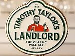
Timothy Taylor’s has redesigned the logos on its Landlord, Boltmaker and Golden Best ales in a bid to make the historic Yorkshire brands more relevant to younger drinkers.
The new artwork features bearded male figures and will appear on pump clips and beer-bottle labels. The refreshed designs have already prompted comparisons with the character used by Spanish-inspired lager brand Madrí Excepcional.
Timothy Taylor’s, a family-owned brewery based in Keighley, West Yorkshire, said the change was intended to attract the next generation without altering the beers themselves.
Andrew Carter, the brewery’s chief executive, said the refresh was not about changing its products, adding that the recipes, ingredients and brewing methods remained the same.
“It’s about making sure the quality and care that go into every pint are reflected in how Timothy Taylor’s is presented today,” he said.
The brewery was founded in 1858 and is best known for Landlord, which it describes as one of Britain’s leading cask ales. Its beers continue to be brewed at Knowle Spring Brewery in Keighley.
The redesign has attracted criticism from some traditional ale enthusiasts. John Rooth, secretary of the Society for the Preservation of Beers from the Wood, said the brewery risked discarding decades of recognition and customer loyalty.
However, Gary Meads, landlord of The Coach and Horses Inn in Worcestershire, said the new design retained elements of the brand’s traditional character while helping it appeal to a younger market.
The updated branding will be introduced gradually across pubs, supermarkets and other retailers over the coming months, meaning old and new designs are expected to appear alongside each other during the transition.
